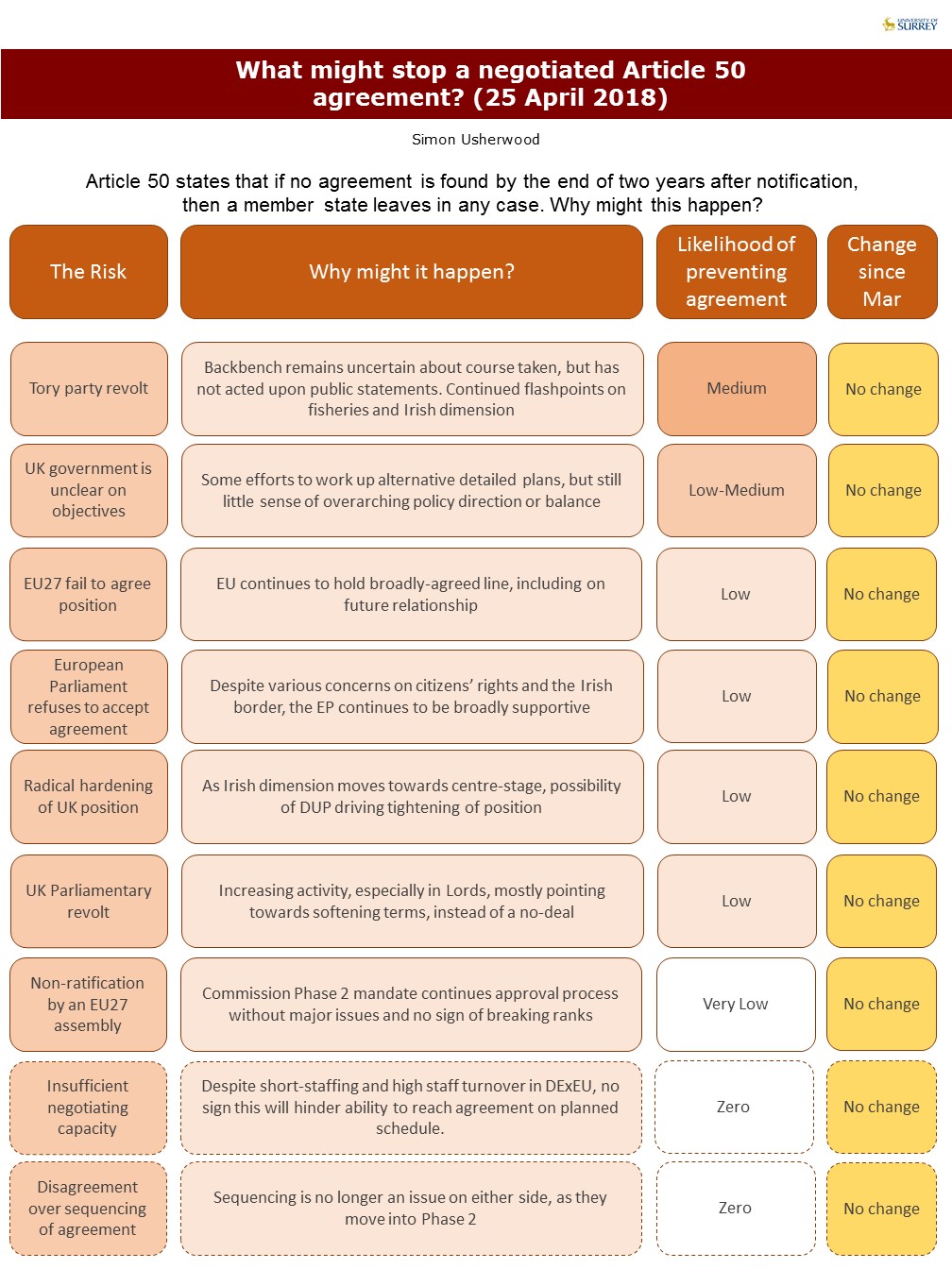
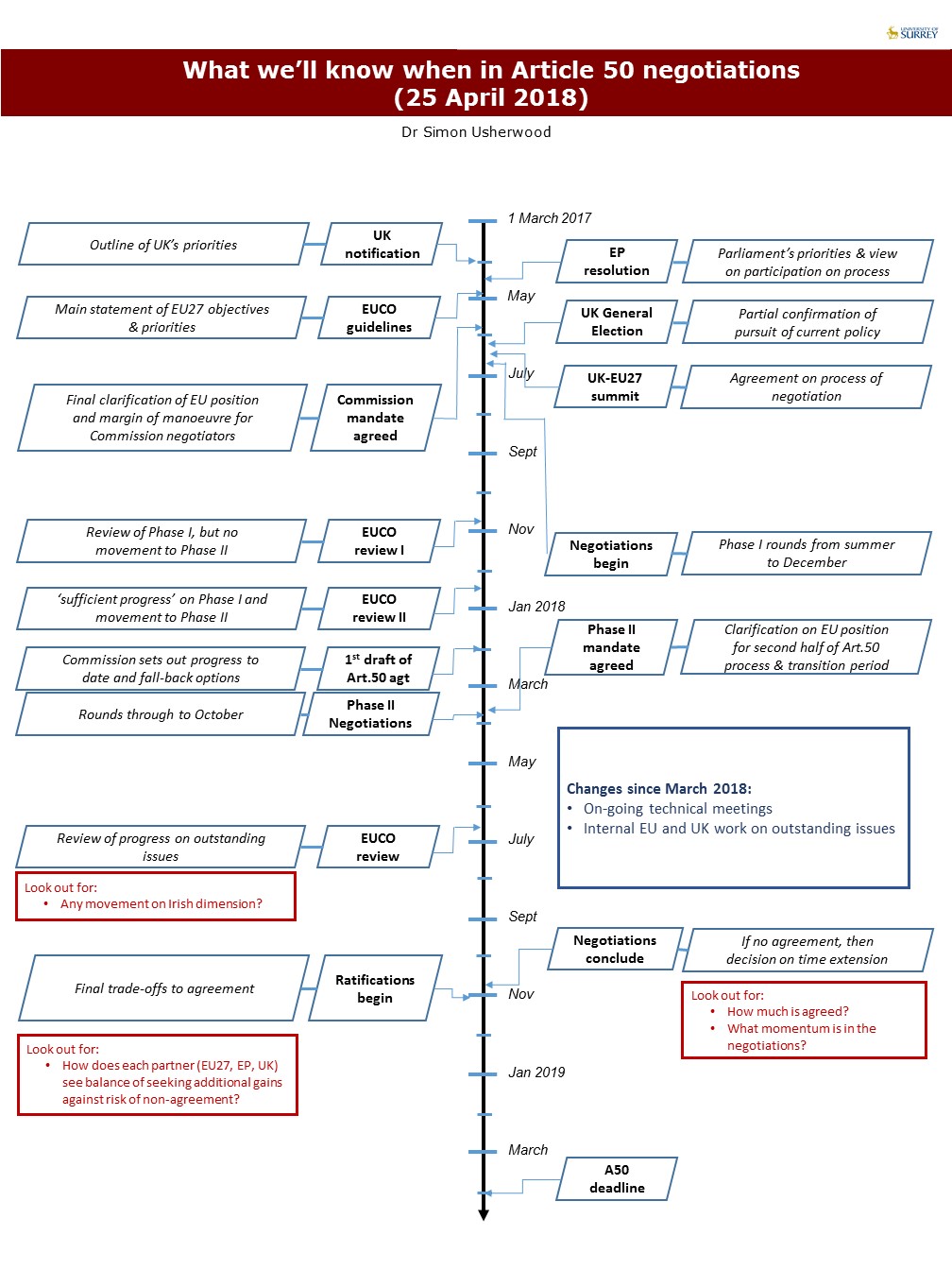
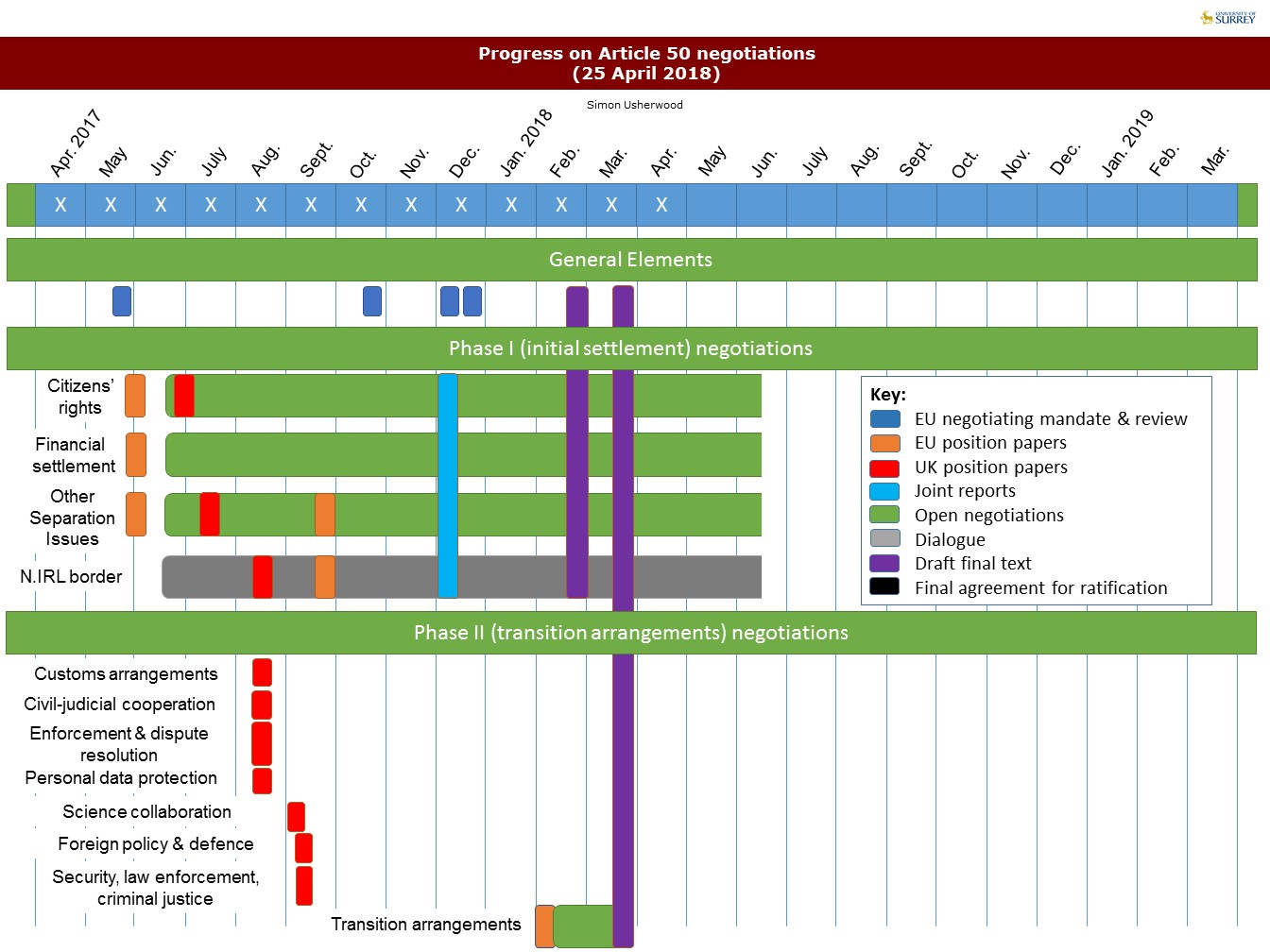
It’s been a quiet month in Brexit-land, because negotiators need holidays too. Hence, there’s been very little movement since the flurry in late March, and consequently not much to add to the graphics.
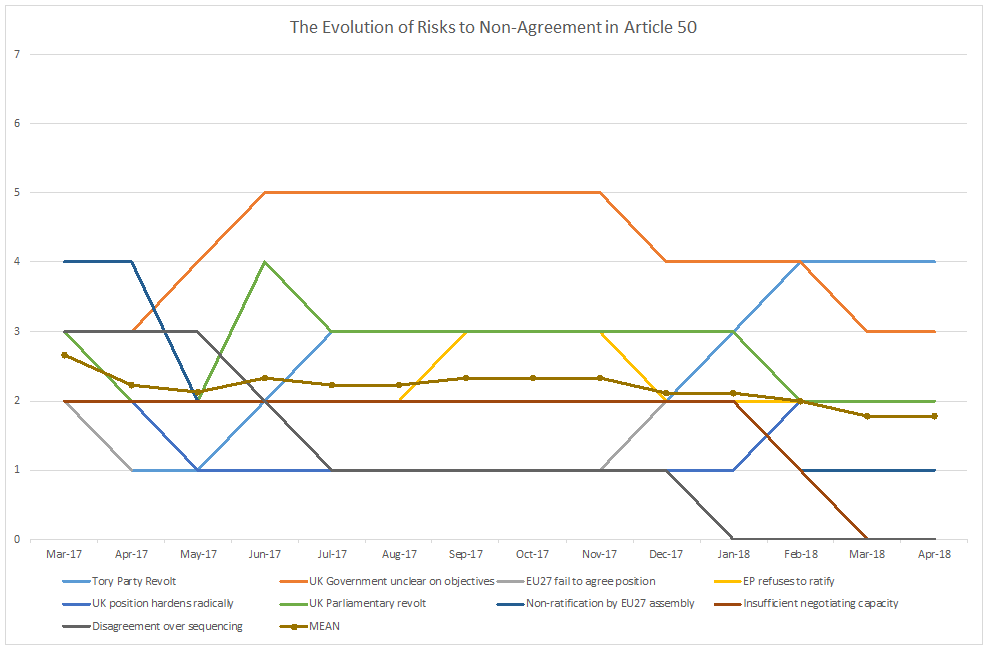
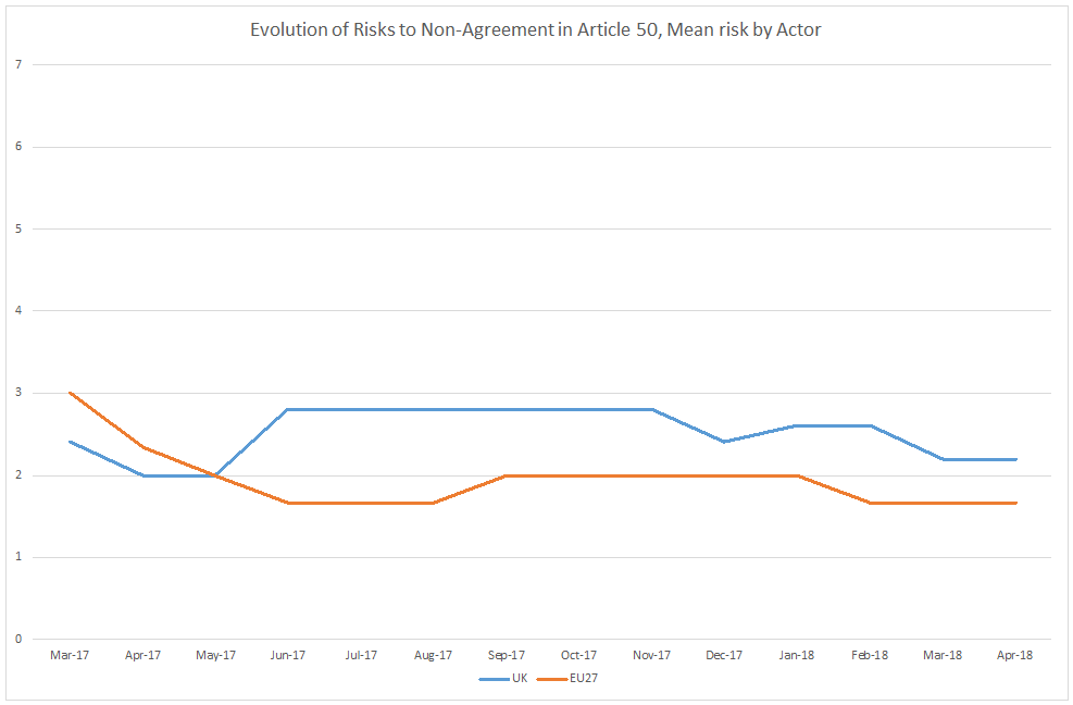
To make up for that, and because I’ve now been doing these for over a year, I’ve made some summary charts of the changing risks to non-agreement. They’re works in progress, so comments welcome (including on how to differentiate lines for the colour-blind), but the main message is that overall there’s a slight reduction in risk, but it remains, and that the problems continue to be more likely to come from the UK end of things.
PDF Versions: A50 timeline Apr 18; A50 progress Apr 18; A50 barriers Apr 18