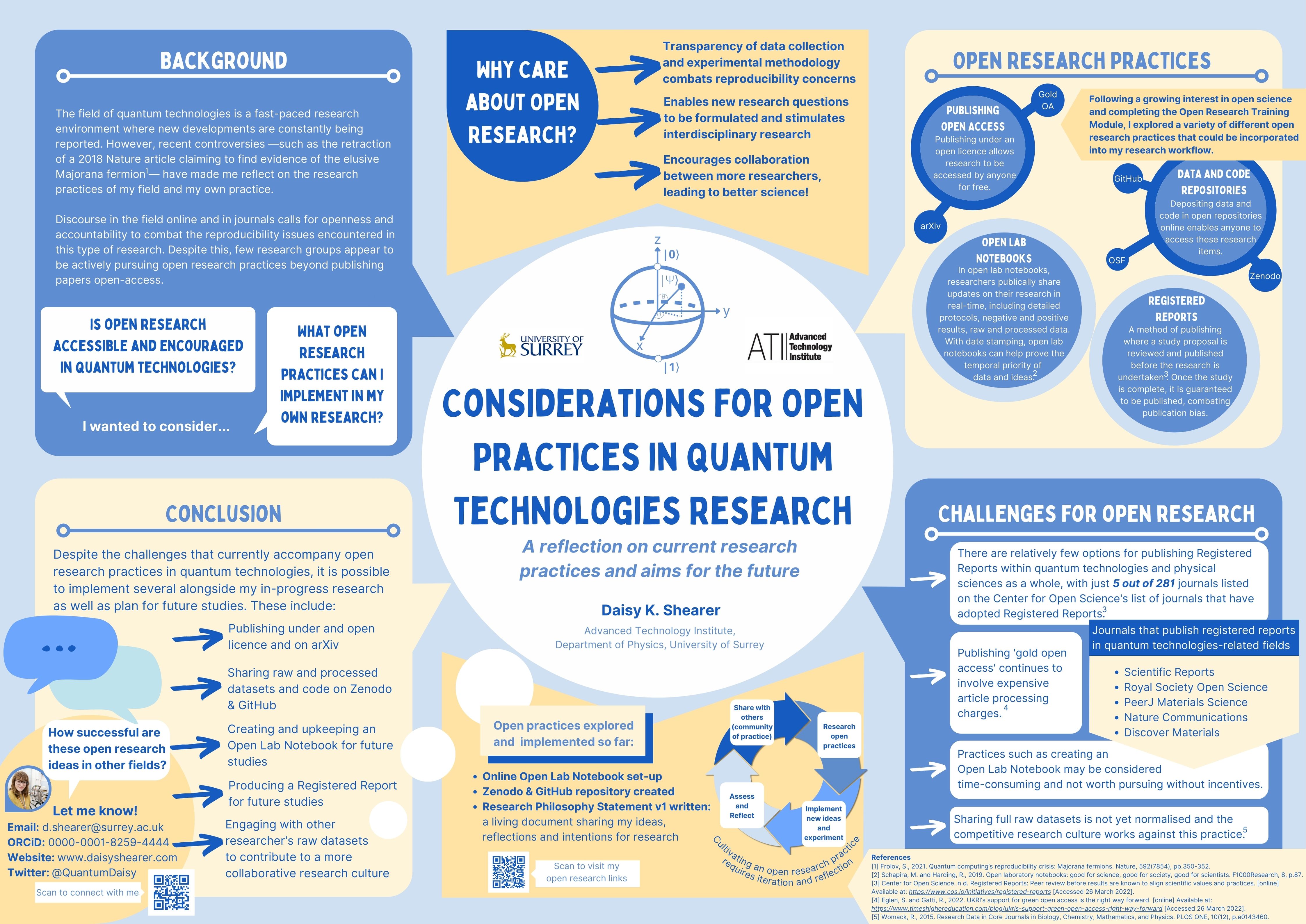
Going to conferences is one of the most exciting parts of being a researcher. It’s an opportunity to share your work with the wider research community, network with others, and get inspiration. One of my favourite parts of a conference is the poster session. I love the challenge of condensing research into a poster format that’s accessible and easily digestible to other conference-goers. Over the years, I’ve made several research posters (even winning awards for some of them) and I think I’ve learned a thing or two so here are my top tips for making conference posters.

1. Decide on your main takeaway message
A poster isn’t a paper so you don’t need to include absolutely everything that you would include in a paper. In fact, you should only focus on one or two key takeaway messages that you want people to engage with. Keep this message in mind as you create your poster.
2. Consider your audience
Different audiences need different approaches. Is your audience a specialised audience within your field or is it a more general audience including people not in your discipline? For the posters I shared above, the audience was extremely broad in both cases so I knew that I needed to steer away from jargon as much as I could and not assume any prior knowledge.
3. Check the formatting guidelines
It’s so easy to do but so easy to forget! Make sure you check the guidelines for posters before you start. For example, my posters had to be landscape and A2 and A0 size respectively. With this as your starting point, you can immediately think about how much space you have to work with.
4. Decide on your colour pallet
Next, I decide on a colour pallet. It’s good to pick three main colours and use varying shades of these. I find it especially useful to use online tools like colourcontrast.cc to check whether my selected colours have enough colour contrast to ensure readability.
5. Think about the visual flow
How are you going to draw people in to look at your poster and how will they know where to look first? In some cases, such as my open research poster, you might want to go for a mind-map sort of style with the title in the middle. In other cases, a more generic poster layout may be more appropriate. Here you can include sections for your aim, background, results, discussion, conclusion, and references. You may even want to use arrows to guide the eye around the different sections. I like to sketch out my initial layout ideas on a piece of paper with my different headings and where I want everything to be.
6. Prepare an initial template
Now that you’ve decided on some of the key aspects of your poster, it’s time to start making it! There are various programs you can make a poster in including PowerPoint, Illustrator, Canva, or even LaTeX. There are plenty of templates available online or, if you’re like me, you might want to create your own basis for your poster. This is the stage where you decide on the different shapes for each section, essentially creating your initial layout idea in your chosen program.
7. Add your visuals
The visuals are the most important part of the poster, so I like to put these in place first. Don’t be afraid to have some of your figures and illustrations ‘bleeding’ over the edge of sections as this can give the poster a bit of charm!
8. Add the text
Use large font sizes! You want to be aiming for at least 85pt for the title, 36pt for subheadings, and 24pt for the main text. In many ways, the bigger the better and you should use an accessible font like Helvetica, Arial, Verdana, and Calibri. You’re also much more likely to have more poster visitors if you try to reduce the amount of text and increase the number of figures, schematics, illustrations, and infographics. When it comes to text on posters, less is more.
9. Add contact details
These days, it’s common to add your contact details to a poster so that people can get in touch even if the author isn’t by the poster when they look at it. I think of this section like a business card. You can include things like your email address, website, ORCiD, and (professional) Twitter handle. I like to create a QR code that links to a linktree page with my professional links. It’s also nice to include a little photo of the main author so people can recognise you around the conference.
10. Review your poster
It’s finally time to check that you’re happy with where everything is on your poster. Does anywhere look too cramped? Is there any text you can get rid of, condense, or make clearer? Why not show it to colleagues, friends and family to get feedback to improve it? Once you’ve made any final changes, you’re ready to go! Just print it off or upload it to the relevant place and look forward to presenting it and sharing your work with others.