It is summer, and one of things academics are supposed to do over summer is look back at how they thought the teaching went, and reflect on the student feedback on what they liked/didn’t like. Then in summer there should be time to fix things that didn’t work so well. I am very bad at this, I always have 10,000 other things to do over the summer, 9,000 of which have deadlines and so I tend to do those instead. This summer is different.
So, I am fixing one of the computational projects our level 2 students do. They each pick one of around 20 projects and then write a program to model the physics. The idea is for them to learn how to model planets, stars, electrons, etc on a computer. I enjoy teaching it and I think many of the projects work really well. The project calculating orbits of planets is usually fun with all sorts of orbits being produced.
But the project modelling traffic jams did not work so well this year. There are many different simple physics models of traffic jams and the project introduction did not clearly pick and describe one.
So, I looked at the different models to pick a simple one with fun physics. I settled on the Nagel-Schreckenberg model. This is a simple cellular automaton model, i.e., a model that represents a road as a series of cells. So, I looked up the original paper and a couple of others, and then drafted a new intro plus suggestions for what the student can do to get started. But then, disaster!
The Wikipedia page on the Nagel-Schreckenberg model was not very good. This is often the first place a student (and indeed me) looks. It needed improvement. So, for the first time, I have edited a Wikipedia page, a bit. It was pretty easy to do. I think it is better, hopefully the description of the algorithm is reasonable now but it could still do with work. As a newbie editor I can’t upload figures so can’t upload figures showing example results, but I think I can do that next week.
The Nagel-Schreckenberg model is quite fun. If you drop action 3 then you get:
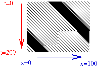
This is a slightly funny way of plotting things that physicists often use. Each black dot is a car and one horizontal line of pixels in the image is the road at one time, the line of pixels below is the same road one unit of time later, and so on. Thus each thin black line slanting to the right is a single car moving to the right as time passes (and you go down the image). The single large band is a traffic jam that is also moving. The jam is not completely stationary but it does move slower than single cars do at a lower density of cars on the road. Also it really is one jam as the program’s road is on a circle, i.e., cars that drive off the right rejoin at the left.
Interestingly, if you add a bit of randomness, things change a lot and you get:
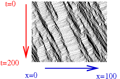
which is very pretty. The single traffic jam has become many smaller mini-jams, which look like waves in this plot. The bottom image in particular is too pretty not to put up on the Wikipedia page. I’ll do that next week … but I’ll probably fix the labels, they’re a bit ugly.