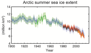
 Very recently, the physical science bit of the 2013 IPCC report on climate change came out. I took a look at the summary for policymakers (link to report here). As I often do with a scientific paper, I got bored quickly with reading the intro, and skipped forward to the figures – where the data is. Scary scary stuff. I don’t know what planet the climate-change deniers are living on, but it isn’t Earth in the 21st century.
Above is the plot of the size of the artic ice cap in summer – the cap grows every winter and shrinks every summer, this gives its size in the summer. Note that there is blindingly obvious trend over the last 50 years, and its downwards. From 1900 to 1980 the size never dropped below 8 million km², since about 2000, it has always been below that figure.
It is worth taking a look at the pdf of the almost final draft of the policymakers summary and scrolling to the bottom, where the figures are. They really do hammer home the changes that are occurring. The evidence is overwhelming.
But there is still work to be done to improve our knowledge of our climate. Figure SPM.5 shows the updated values of the different contributions to global warming. The error bars in the contribution from nanoparticles in the atmosphere look about as big as in the last report in 2007 (see an earlier post). So clearly, there is still work to be done there. Our climate in general, and clouds in particular, are complex things. IPCC reports, like most science, are provisional in the sense that there is always more to learn. But also like a lot of good science, that does not mean that strong conclusions cannot be drawn from our existing understanding.
